
USER EXPERIENCE DESIGN

elegant note-taking
Bear
The applied practice of optimizing the on-boarding experience
Overview
We were tasked to develop a feature for an already-made application, and to user test and prototype the redesign experience.
TEAM & DURATION
As the Lead Visual Designer, my role was to build out the wireframe and prototype using consistent pre-existing branding styling.
TOOLS & METHODS
Figma
Storyboarding
User interviews
InDesign for Visual style guide
Research
“If you’ve spent years dumping your thoughts into something like Evernote, or your Mac’s Note’s app, you’re going to resist switching to something new. ”
Why are users deleting the app?
They can’t find the settings
The on-boarding could be better
They don’t know how to use markdown
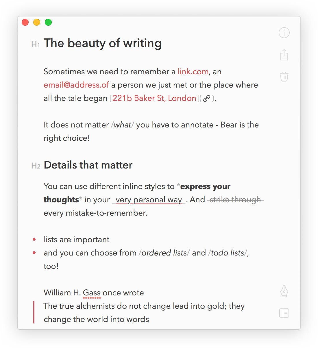
Currently, Bear on-boards new users with four pre-loaded notes, describing the capabilities and showing off the beautiful, formatted, end result.

The Problem
“Where are the settings”
We found that while many of the target users are active on social media, and digital publishing, they do not know how to write markup syntax. The app is simple, and easy to use for those who know the language, but useless and cluttered for those who don’t.


The Solution
PRovide in-app on-boarding, to increase app engagement and user satisfaction.
Process
Move Fast with stakeholders
Get Messy Early
We filled our days in these early parts of the project with rough sketches, white-boarding and participatory design sessions with the client, and lots of ideas jotted down on post-it notes. This helped us wrap our heads around a problem that spanned different users, associates, locations and devices.
INVITE USERS INTO YOUR PROCESS
The second part of our approach was to invite users and customers into our process. One of our most effective strategies was to test our hand-drawn sketches with users and to iterate the sketches within or between each testing session. We even handed our sharpies to users and let them sketch out their own ideas.
RESEARCH IN CONTEXT
The success of our design hinged partially on customers’ willingness to embrace in-store digital tools which, from a research perspective, meant we needed to go beyond testing interfaces to testing experiences in the retail context. Our research activities included visits to customers’ homes throughout the U.S. and to the Best Buy prototype store near Minneapolis.


The Solution
Provide unobtrusive In-App On-boarding: Getting your bearings
Through user research, it was found that first time app users are quick to tap through on-boarding. To provide a better in-app learning experience, tips and tools were designed to complement the application experience itself, rather than detour from it. Bear is a clean, intuitive app, so the on-boarding experience likewise.
Color and form was used to differentiate on-boarding tips from the application itself. By breaking free from the soft grays and burgundy, this new on-boarding experience provided users what they wanted to know, when they needed to know it.
